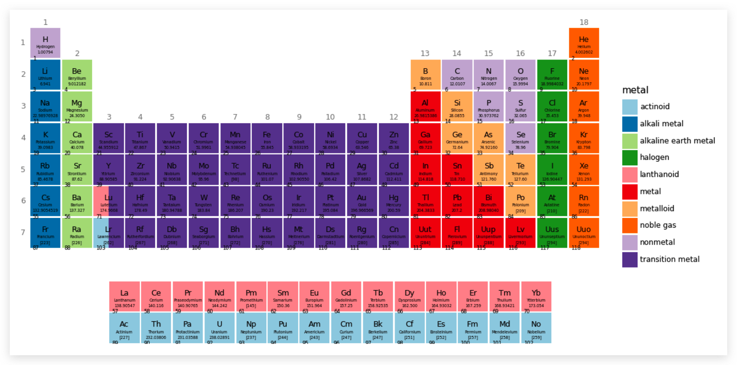
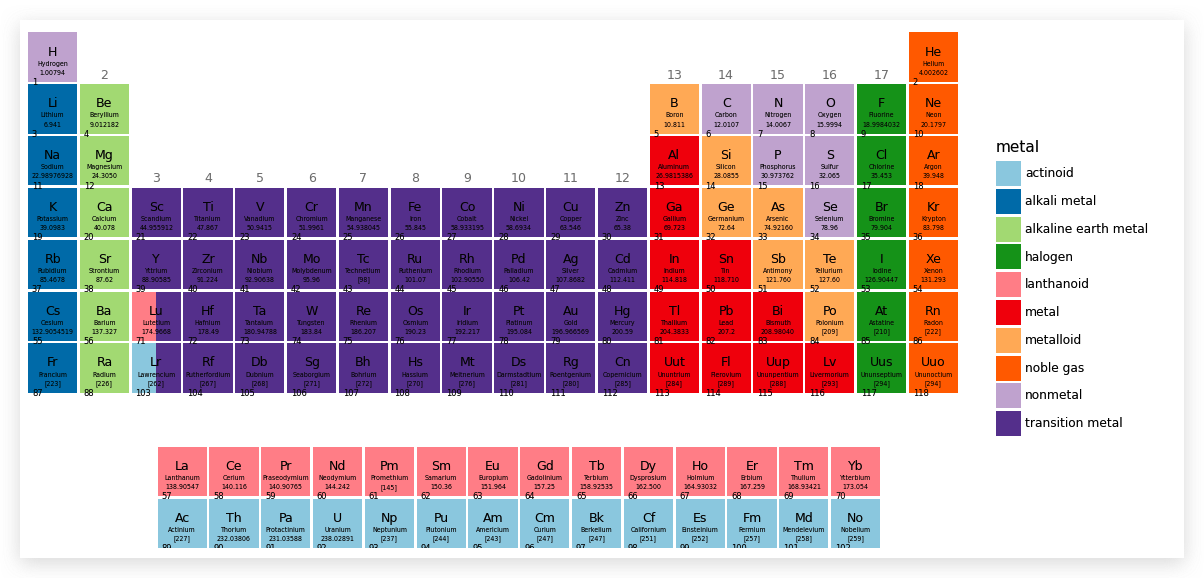
首先需要了解元素周期表以及元素数据:
维基百科的元素周期表词条
元素数据
元素周期表基本构成如下:
- 族:表中的每一列就是一族,从左向右依次为 1、2……18 族。
- 周期:表中的行。
- 元素:每个方框表示一个元素,其中包括元素符号、名称、原子序数、原子量。
- 在主表下面还有镧系元素和锕系元素表。
- 用颜色区分金属、非金属等常见的物质状态。
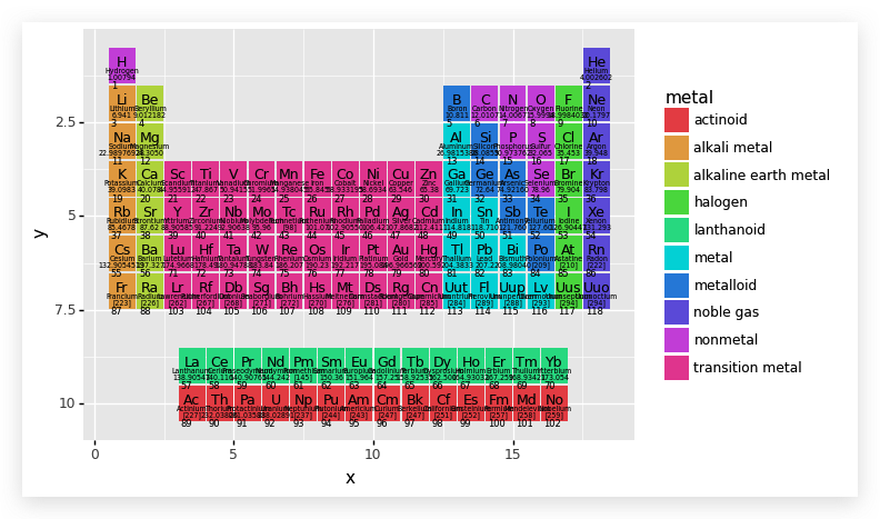
最终呈现:
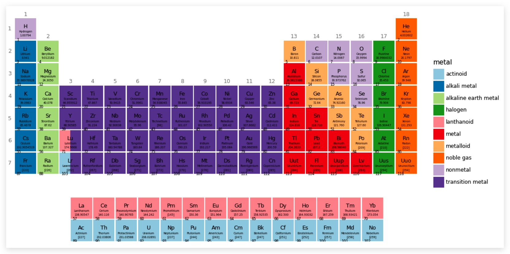
其他形状元素周期表
导入和处理数据
1
2
3
4
5
6
7
|
import pandas as pd
import numpy as np
from plotnine import *
elements = pd.read_csv('~/data/cbcpv/elemanets/elements.csv')
|
研究数据集
1
2
3
4
5
6
7
8
9
10
11
12
13
14
15
16
17
18
19
20
21
22
23
24
25
26
27
28
29
30
31
32
| elements.info()
"""
<class 'pandas.core.frame.DataFrame'>
RangeIndex: 118 entries, 0 to 117
Data columns (total 21 columns):
# Column Non-Null Count Dtype
--- ------ -------------- -----
0 atomic number 118 non-null int64
1 symbol 118 non-null object
2 name 118 non-null object
3 atomic mass 118 non-null object
4 CPK 118 non-null object
5 electronic configuration 118 non-null object
6 electronegativity 97 non-null float64
7 atomic radius 71 non-null float64
8 ion radius 92 non-null object
9 van der Waals radius 38 non-null float64
10 IE-1 102 non-null float64
11 EA 85 non-null float64
12 standard state 99 non-null object
13 bonding type 98 non-null object
14 melting point 101 non-null float64
15 boiling point 94 non-null float64
16 density 96 non-null float64
17 metal 118 non-null object
18 year discovered 118 non-null object
19 group 118 non-null object
20 period 118 non-null int64
dtypes: float64(8), int64(2), object(11)
memory usage: 19.5+ KB
"""
|
特征group就是该元素所在的族,但是,如果用elements['group']
查看所有内容,会发现有的记录中用 '-'
标记,说明它不属于任何族,说明它们应该是镧系元素或者锕系元素。根据数据分析的通常要求,'-'
符号最好用数字表示,这里用 ﹣1
转化数据集
1
2
3
4
5
6
7
8
9
10
11
12
13
14
15
16
17
18
|
elements['group'] = [-1 if g=='-' else int(g) for g in elements['group']]
elements['group']
"""
0 1
1 18
2 1
3 2
4 13
..
113 14
114 15
115 16
116 17
117 18
Name: group, Length: 118, dtype: int64
"""
|
特征 bonding type、metal 都是分类数据,因此在类型上进行转化。
1
2
3
|
elements['bonding type'] = elements['bonding type'].astype('category')
elements['metal'] = elements['metal'].astype('category')
|
将原本的整数型 atomic number 特征,转化为字符串类型
1
| elements['atomic_number'] = elements['atomic number'].astype(str)
|
元素周期表有两个部分,上面一部分每个元素是属于某一个族的,即 group
特征中的 1-18, 而对于值是-1
的则表示这些元素应该在下面的镧系或者锕系元素表中。下面分别用 top 变量和
bottom 变量引用这两部分元素集合.
1
2
3
|
top = elements.query('group != -1').copy()
bottom = elements.query('group == -1').copy()
|
元素周期表中横向表示的是族(group),纵向表示的是周期(period),用下面的方式在
top 中创建两个特征,分别为“族”和“周期”的值。
1
2
3
4
5
6
7
8
9
10
11
12
13
14
15
16
17
18
19
20
21
22
23
24
25
26
27
28
29
30
31
32
33
34
35
36
37
38
|
"""
横向表示族,纵向表示周期
"""
top['x'] = top.group
top['y'] = top.period
top['x']
"""
0 1
1 18
2 1
3 2
4 13
..
113 14
114 15
115 16
116 17
117 18
Name: x, Length: 90, dtype: int64
"""
top['y']
"""
0 1
1 1
2 2
3 2
4 2
..
113 7
114 7
115 7
116 7
117 7
Name: y, Length: 90, dtype: int64
"""
|
除了上面的部分之外,下面的锕系和镧系元素也要做类似的配置。不过,横坐标不能用
group 特征的值,因为前面设置为 ﹣1。
1
2
3
4
5
6
7
8
| nrows = 2
"""
hshift 和 vshift 分别表示横、纵间距,这样就为每个锕系和镧系元素增加了横纵坐标值。
"""
hshift = 3.5
vshift = 3
bottom['x'] = np.tile(np.arange(len(bottom) // nrows), nrows) + hshift
bottom['y'] = bottom.period + vshift
|
每个元素都占了一个小方块,所以,这个小方块(元素块)的大小要设置一下
1
2
3
|
tile_width = 0.95
tile_height = 0.95
|
开始画图
1
2
3
4
| (ggplot(aes('x', 'y'))
+ geom_tile(top, aes(width=tile_width, height=tile_height))
+ geom_tile(bottom, aes(width=tile_width, height=tile_height))
)
|
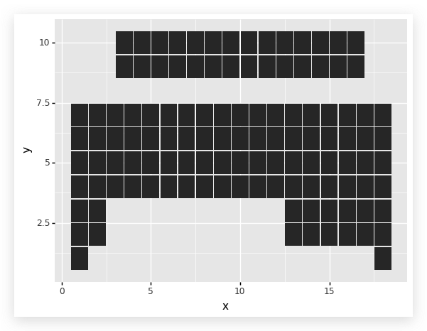
这里只有美学映射,没有传入数据集.因为在图层对象中,要传入不同的数据集:
“top”和“bottom”.
top 表示主表中的, bottom 表示下面的锕、镧系元素
geom_tile绘制安放元素块图层,并使用 top
数据集,在引入一个图层,绘制 bottom 对应的图层. 但是我们发现表反了,
所以需要实现在 Y 轴方向上的坐标轴翻转.
1
2
3
4
5
6
| (ggplot(aes('x', 'y'))
+geom_tile(top, aes(width=tile_width, height=tile_height))
+geom_tile(bottom, aes(width=tile_width, height=tile_height))
+scale_y_reverse()
)
|
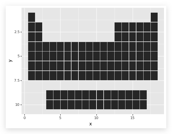
基本样式已经有了。
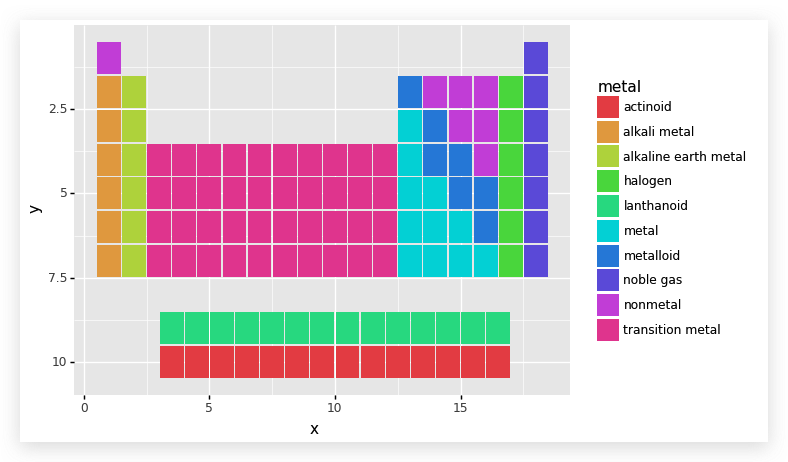
前面已经把特征“metal”的数据转换为分类数据,下面用这些数据对不同元素的小矩形(以后简称“元素块”)上色。
1
2
3
4
5
6
7
| (ggplot(aes('x', 'y'))
+ aes(fill='metal')
+ geom_tile(top, aes(width=tile_width, height=tile_height))
+ geom_tile(bottom, aes(width=tile_width, height=tile_height))
+ scale_y_reverse()
)
|
然后,我们要将化学元素的有关信息写到这些元素块上,这里要写到元素块上的包括:
- 原子序数,对应着数据集中的特征是“atomic number”;
- 元素符号,对应着数据集中的特征是“symbol”;
- 元素名称,对应着数据集中的特征是“name”;
- 原子量,对应着数据集中的特征是“automic mass”
在这里,我们要绘制四个图层,以便安放四个元素信息,
每个图层上面一个特征,并且每个图层的位置、字号大小等都不相同.
为此我们写一个函数方法来实现:
1
2
3
4
5
6
7
8
9
10
11
12
13
14
15
16
17
18
19
20
| """
nudge_x: 文本在水平方向上的相对位置
nudge_y: 文本在竖直方向上的相对位置
ha: 可选'left', 'center', 'right', 标示水平方向的对齐方式
va: 可选'top', 'center', 'bottom', 表示竖直方向的堆砌方式
size: 字号大小
fontweight: 字族中的字体粗细
"""
def inner_text(data):
layers = [geom_text(data, aes(label='atomic_number'),
nudge_x=-0.40, nudge_y=-.40,
ha='left', va='top', fontweight='normal', size=6),
geom_text(data, aes(label='symbol'),
nudge_y=.1, size=9),
geom_text(data, aes(label='name'),
nudge_y=-0.125, fontweight='normal', size=4.5),
geom_text(data, aes(label='atomic mass'),
nudge_y=-.3, fontweight='normal', size=4.5)
]
return layers
|
然后我们将函数inner_text应用到绘图流程中去
1
2
3
4
5
6
7
8
9
10
11
12
13
| """
分别调用两次是因为有 top 和 bottom 两个数据
"""
(ggplot(aes('x', 'y'))
+ aes(fill='metal')
+ geom_tile(top, aes(width=tile_width, height=tile_height))
+ geom_tile(bottom, aes(width=tile_width, height=tile_height))
+ inner_text(top)
+ inner_text(bottom)
+ scale_y_reverse()
)
|
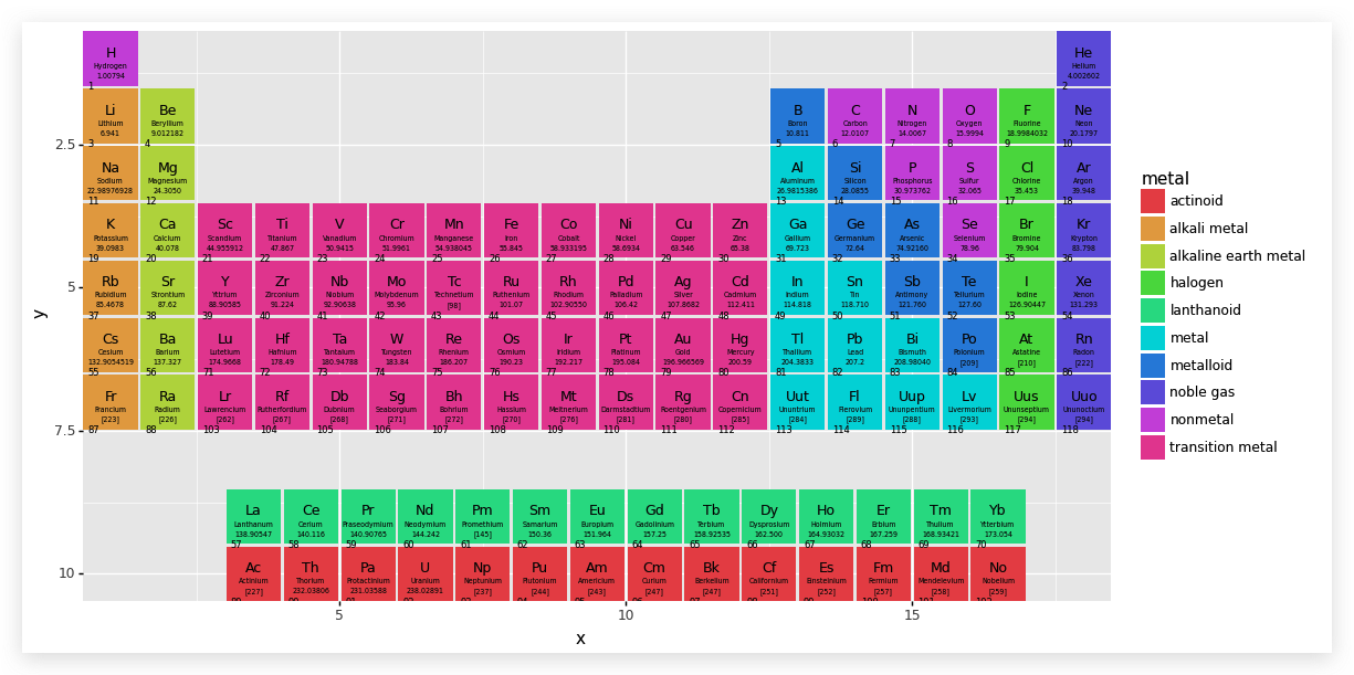
是不是觉得图很难看,原因在于我们还没对其进行调整,下面我们就要细微的调整图层,包括大小等
1
2
3
4
5
6
7
8
9
10
11
12
13
| (ggplot(aes('x', 'y'))
+ aes(fill='metal')
+ geom_tile(top, aes(width=tile_width, height=tile_height))
+ geom_tile(bottom, aes(width=tile_width, height=tile_height))
+ inner_text(top)
+ inner_text(bottom)
+ scale_y_reverse()
+ coord_equal(expand=False)
+ theme(figure_size=(12,6))
)
|
在默认的主题中,横纵坐标的图上长度相等,也就是图像是呈现在一张正方形的图纸上,coord_equal
的作用就是设置坐标系的横轴和纵轴,它与 coord_fixed
是完全等效的,能够改变图纸的大小和长宽比例。参数 expand
的值是布尔值,如果为
False,则意味着坐标系的大小(即图纸的大小)由制图所用数据决定。
新增的第二个图层对象是一个新的主题,在其中规定了图纸的尺寸。
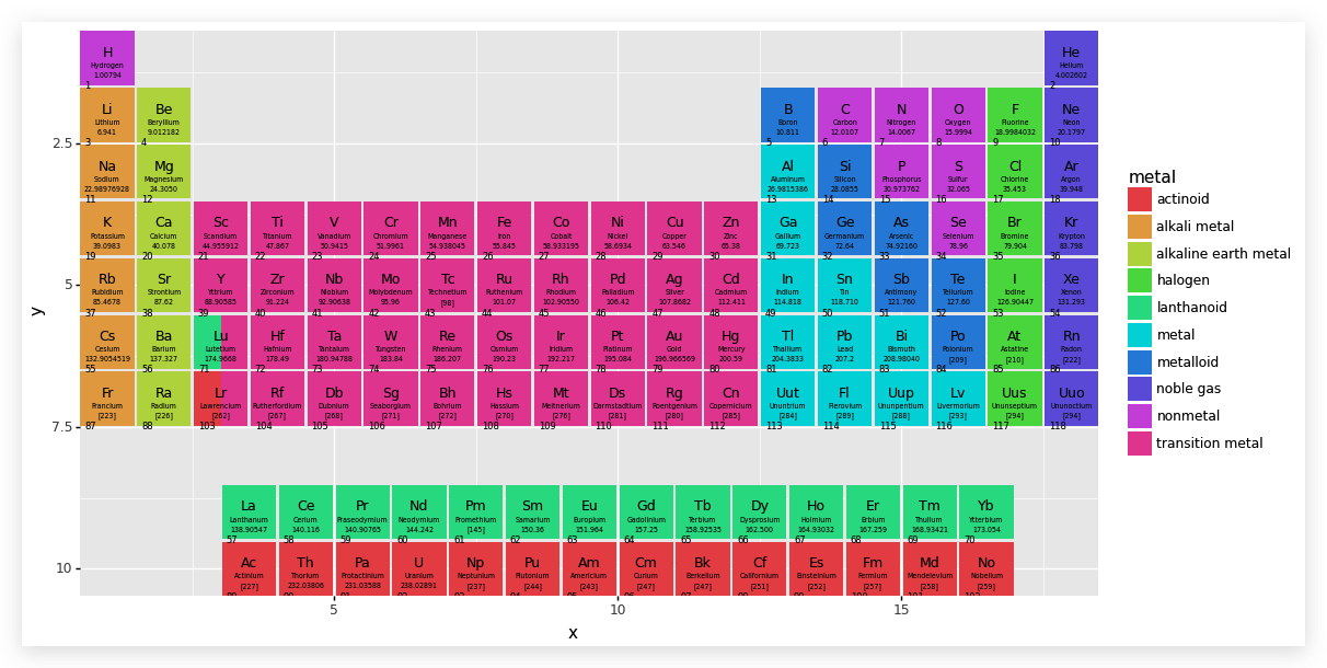
我们仔细研究元素周期表,发现 Lu 和 Lr
两个元素比较特殊,其实它们不是单独的元素,而是对应着下部分两行的,因此要对这两个进行处理,以区分出与其他元素的不同.
我们将其分为两半,使用过 PS
作图的同学应该能想到两个不同颜色的图层叠加,上面的图层只有下面图层的一半,那么看起来就像是被分成了两半.
1
2
3
4
5
6
|
split_df = pd.DataFrame({
'x': 3-tile_width/4,
'y': [6,7],
'metal': pd.Categorical(['lanthanoid', 'actinoid'])
})
|
1
2
3
4
5
6
7
8
9
10
11
12
| (ggplot(aes('x','y'))
+ aes(fill='metal')
+ geom_tile(top, aes(width=tile_width, height=tile_height))
+ geom_tile(split_df, aes(width=tile_width/2, height=tile_height))
+ geom_tile(bottom, aes(width=tile_width, height=tile_height))
+ inner_text(top)
+ inner_text(bottom)
+ scale_y_reverse()
+ coord_equal(expand=False)
+ theme(figure_size=(12, 6))
)
|
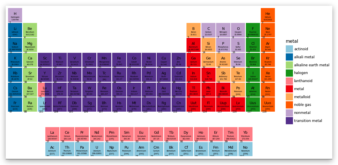
基本制作完成了,下面来美化一下:
1
2
3
4
5
6
7
8
9
10
11
12
13
14
15
16
17
18
| (ggplot(aes('x', 'y'))
+ aes(fill='metal')
+ geom_tile(top, aes(width=tile_width, height=tile_height))
+ geom_tile(split_df, aes(width=tile_width/2, height=tile_height))
+ geom_tile(bottom, aes(width=tile_width, height=tile_height))
+ inner_text(top)
+ inner_text(bottom)
+ scale_y_reverse()
+ scale_fill_brewer(type='qual', palette=3)
+ coord_equal(expand=False)
+ theme_void()
+ theme(figure_size=(12, 6),
plot_background=element_rect(fill='white')
)
)
|
到最后了,我们要解决主表中的元素表上族和周期的问题
观察主表中的每一列,注意我们已经把 Y 轴映射反序了,如果在 H
元素的元素块上标注族的序号为“1”, 那么这个“1”的 Y 轴坐标应该是 y=1,
同样,Sc 元素块上标注族的需要“3”, 那么“3”的 Y 轴坐标应该是 y=4.
这样,我们就可以创建每列及其对应的 Y 轴坐标了.
1
2
3
4
5
6
7
|
groupdf = pd.DataFrame({
'group': range(1, 19),
'y': np.repeat([1,2,4,2,1], [1,1,10,5,1])
})
groupdf
|
| 0 |
1 |
1 |
| 1 |
2 |
2 |
| 2 |
3 |
4 |
| 3 |
4 |
4 |
| 4 |
5 |
4 |
| 5 |
6 |
4 |
| 6 |
7 |
4 |
| 7 |
8 |
4 |
| 8 |
9 |
4 |
| 9 |
10 |
4 |
| 10 |
11 |
4 |
| 11 |
12 |
4 |
| 12 |
13 |
2 |
| 13 |
14 |
2 |
| 14 |
15 |
2 |
| 15 |
16 |
2 |
| 16 |
17 |
2 |
| 17 |
18 |
1 |
让我们来标注族的序号
1
2
3
4
5
6
7
8
9
10
11
12
13
14
15
16
17
18
19
20
21
22
23
24
25
26
27
|
(ggplot(aes('x','y'))
+ aes(fill='metal')
+ geom_tile(top, aes(width=tile_width, height=tile_height))
+ geom_tile(split_df, aes(width=tile_width/2, height=tile_height))
+ geom_tile(bottom, aes(width=tile_width, height=tile_height))
+ inner_text(top)
+ inner_text(bottom)
+ geom_text(groupdf, aes('group', 'y', label='group'),
color='gray', nudge_y=.525, va='bottom',
fontweight='normal', size=9, inherit_aes=False
)
+ scale_y_reverse()
+ scale_fill_brewer(type='qual', palette=3)
+ coord_equal(expand=False)
+ theme_void()
+ theme(figure_size=(12, 6),
plot_background=element_rect(fill='white'),
)
)
|
最终,我们标注玩周期就完成了.
周期是对每一行的标注,一共 7 行,因为标注在左侧,可以把它看成是左侧的 Y
轴标示,可以在图层上通过对 Y 轴标示的设置完成周期的标注.
1
2
3
4
5
6
7
8
9
10
11
12
13
14
15
16
17
18
19
20
21
22
23
24
25
26
27
28
29
30
31
32
33
34
35
36
37
38
|
(ggplot(aes('x', 'y'))
+ aes(fill='metal')
+ geom_tile(top, aes(width=tile_width, height=tile_height))
+ geom_tile(split_df, aes(width=tile_width/2, height=tile_height))
+ geom_tile(bottom, aes(width=tile_width, height=tile_height))
+ inner_text(top)
+ inner_text(bottom)
+ geom_text(groupdf, aes('group', 'y', label='group'),
color='gray', nudge_y=.525,
va='bottom', fontweight='normal', size=9,
inherit_aes=False
)
+ scale_y_reverse(breaks=range(1, 8),
limits=(0, 10.5)
)
+ scale_fill_brewer(type='qual', palette=3)
+ coord_equal(expand=False)
+ theme_void()
+ theme(figure_size=(12, 6),
plot_background=element_rect(fill='white'),
axis_text_y=element_text(margin={'r':5}, color='gray',
size=9)
)
)
|
完成...