「马拉松跑步数据
先引入数据,准备进行分析
1 | |
OUT:
| age | gender | split | final | |
|---|---|---|---|---|
| 19841 | 34 | M | 01:55:25 |
04:50:03 |
| 11002 | 28 | W | 01:55:00 |
04:11:00 |
| 11619 | 26 | M | 01:40:28 |
04:13:52 |
| 4068 | 34 | M | 01:38:30 |
03:30:21 |
| 6922 | 35 | M | 01:37:44 |
03:48:37 |
这个数据集有以下几个特征:
- age,运动员的年龄
- gender,运动员的性别
- split,半程所用时间
- final,全程所用时间,即最终成绩
自然,要先了解下数据的具体情况
1 | |
可以看到并没缺失值,
不过split和final特征中的数据不实数字类型,
用字符串表示了所用时间长度, 所以我们需要进行转化:
1 | |
使用完成的方法进行数据转换,我们从新读取一下数据:
1 | |
这次数据已经转换为timedelta64类型,
下面我们就要转化时间为整数, 一般的做法都是秒或者毫秒数:
1 | |
我们看到的输出结果,是“纳秒“(ns)单位:
\[1s=10^9ns\]
我们还需要转化为秒:
1 | |
然后我们要讲split和final两个特征的数据进行转化
1 | |
OUT:
| age | gender | split | final | split_sec | final_sec | |
|---|---|---|---|---|---|---|
| 11725 | 35 | M | 0 days 01:53:53 |
0 days 04:14:19 |
6833.0 | 15259.0 |
| 19815 | 24 | M | 0 days 01:58:45 |
0 days 04:49:57 |
7125.0 | 17397.0 |
| 5754 | 49 | M | 0 days 01:42:39 |
0 days 03:41:05 |
6159.0 | 13265.0 |
| 33166 | 46 | M | 0 days 02:31:37 |
0 days 06:06:17 |
9097.0 | 21977.0 |
| 9226 | 36 | W | 0 days 01:49:06 |
0 days 04:01:55 |
6546.0 | 14515.0 |
现在多了两个特征split_sec和final_sec,
都是以秒为单位的浮点数.
描述统计
先了解数据:
1 | |
OUT:
| age | split | final | split_sec | final_sec | |
|---|---|---|---|---|---|
| count | 37250.000000 | 37250 | 37250 | 37250.000000 | 37250.000000 |
| mean | 40.697369 | 0 days 02:03:54.425664429 |
0 days 04:48:09.303597315 |
7434.425664 | 17289.303597 |
| std | 10.220043 | 0 days 00:22:55.093889674 |
0 days 01:03:32.145345151 |
1375.093890 | 3812.145345 |
| min | 17.000000 | 0 days 01:05:21 |
0 days 02:08:51 |
3921.000000 | 7731.000000 |
| 25% | 33.000000 | 0 days 01:48:25 |
0 days 04:02:24 |
6505.000000 | 14544.000000 |
| 50% | 40.000000 | 0 days 02:01:13 |
0 days 04:44:25 |
7273.000000 | 17065.000000 |
| 75% | 48.000000 | 0 days 02:16:11 |
0 days 05:27:36 |
8171.000000 | 19656.000000 |
| max | 86.000000 | 0 days 04:59:49 |
0 days 10:01:08 |
17989.000000 | 36068.000000 |
居然年龄上最大的数据是 86, 让我们看看特征的数据分布:
1 | |
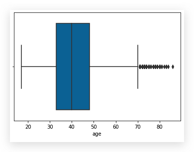
这个箱线图反应了, 数据里确实有一些“离群值”.
数据分布
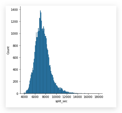
研究下数据分布,
看看split_sec和final_sec
1 | |
1 | |
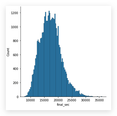
整体看来,两个特征下的数据都符合正态分布,
但是final_sec的分布图比较胖.
这次我们把gender这个分类特征添加进来:
1 | |

这些看到, 男性运动员在总体上还是比女性运动员要快一些.
寻找优秀的原因
跑马拉松或者了解这项运动的人都清楚, 运动员很关注整个赛程中前后半程的时间比较,好的选手是后半程用时和前半程近似. 因此, 我们来研究下, 这些运动员前后半程用时情况.
1 | |
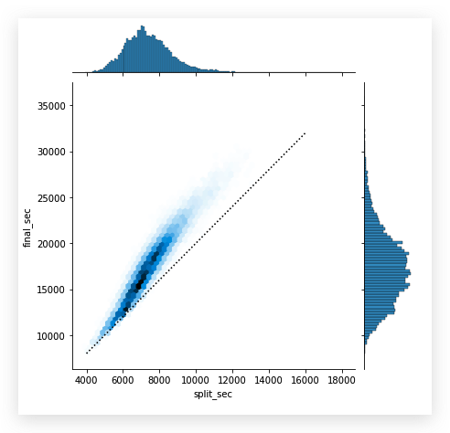
横坐标是splict_sec特征, 即半程用时.
纵轴表示final_sec特征, 全程用时. 途中可以看出,
的确是越优秀的运动员,前半程用时越接近全程用时的一半,
甚至还有少数后半程跑的更快的.
我们做个计算来深入研究下:
1 | |
OUT:
| age | gender | split | final | split_sec | final_sec | split_frac | |
|---|---|---|---|---|---|---|---|
| 2065 | 35 | W | 0 days 01:31:41 |
0 days 03:14:40 |
5501.0 | 11680.0 | 0.058048 |
| 9001 | 43 | W | 0 days 01:58:19 |
0 days 04:00:44 |
7099.0 | 14444.0 | 0.017031 |
| 30039 | 34 | M | 0 days 02:25:17 |
0 days 05:39:21 |
8717.0 | 20361.0 | 0.143755 |
| 27456 | 62 | W | 0 days 02:13:28 |
0 days 05:25:01 |
8008.0 | 19501.0 | 0.178709 |
| 13335 | 41 | M | 0 days 01:45:36 |
0 days 04:21:00 |
6336.0 | 15660.0 | 0.190805 |
用直方图再增加一个参考线来看看split_frac特征中的数据分布:
1 | |
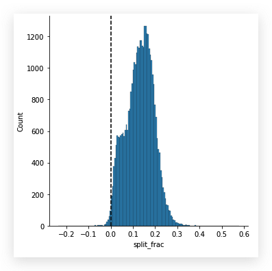
从这张图中, 更清晰的看到全体参赛者的运动安排.
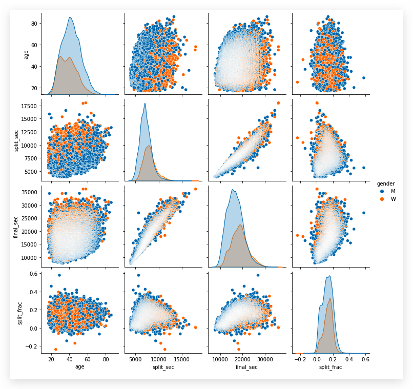
再来探究下不同特征之间的关系:
1 | |
让我们来看下 80 岁选手的数量:
1 | |
下面, 我们划分下年龄段,看看各年龄段的成绩分布:
1 | |
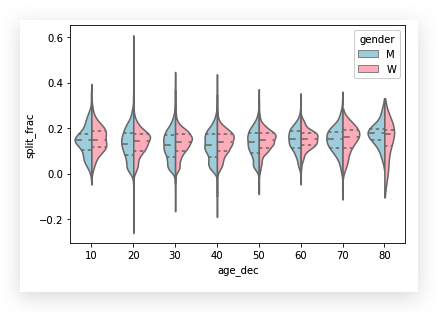
看这张图,
我们发现,不同性别的运动员的split_frac特征数据分布中,
年龄越大,前后端的时间分布比相对集中.
再看看全程用时分布比较:
1 | |
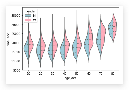
从 30 岁往后, 明显年纪越大,用时越长.
「马拉松跑步数据